The Psychology Of Typography
Typography is more than just choosing a font for your text. It’s about creating an emotional connection with your audience, conveying meaning through the use of different typefaces, and enhancing the visual impact of your message.
In Typography 101, we’ll take a dive into the world of typography and explore how to use fonts to convey emotion and meaning. You’ll learn the different types of typefaces and how to choose the right font for your project, as well as how to use typography to create a hierarchy of information and draw attention to specific elements of your design.
But it’s not just about aesthetics. We’ll also look into the psychology of font selection and how it can influence perception and communication. You’ll discover how fonts can evoke different emotions and most importantly how to use typography to create a tone that resonates with your audience.
Whether you’re a designer, marketer, or anyone looking to improve their visual communication, this guide is the ultimate resource for learning how to use fonts to convey the right emotions and meanings.
Type is a beautiful group of letters, not a group of beautiful letters.
Matthew Carter- British Type Designer
The Different Types Of Typefaces
Understanding the different types of typefaces and their unique characteristics helps you to effectively convey the intended message and emotion.
Serif fonts, with their small lines or flourishes at the end of each stroke, are often associated with traditional or classic designs. On the other hand, sans-serif fonts, which lack these flourishes, are often associated with modern or minimalistic designs.
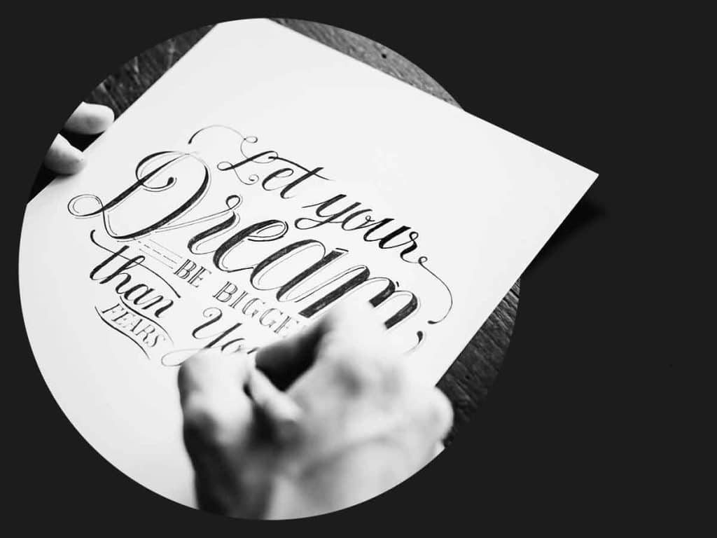
Script fonts mimic handwriting and can convey elegance, femininity, or informality. Display fonts, on the other hand, are designed to be used at larger sizes and can be highly decorative and eye-catching.
Monospaced fonts have equal spacing between each character, making them useful for coding or tabular data. However, they can be seen as somewhat mechanical or sterile in appearance.
Lastly, handwritten fonts mimic handwriting but are more casual and playful than script fonts. They’re often used to convey a personal touch or a sense of informality.
Understanding the different types of typefaces and how they can affect the mood and tone of your design is crucial to conveying the right message to your audience. With this knowledge, you can choose the right font for your project and make a powerful impact with your typography.

Knowing the above information about the different types of typefaces is crucial to selecting the right font for your project. Each typeface has its own unique characteristics that can affect the mood and tone of your design, and choosing the wrong typeface can convey the wrong message to your audience.
For example, a serif font may be appropriate for a traditional or formal design, while a sans-serif font may be better suited for a modern or minimalist design. A script font may convey elegance or informality, depending on the design context. Display fonts can be highly decorative and eye-catching, making them suitable for headings or titles. Monospaced fonts may be useful for coding or tabular data, but could be seen as sterile in other contexts. Handwritten fonts can convey a personal touch or a sense of informality.
By understanding the different types of typefaces and their characteristics, you can choose the right font to effectively convey your intended message and emotion to your audience.
Creating Hierarchy To Draw Attention
Creating hierarchy using typefaces is an important aspect of typography, as it helps to draw attention to specific elements of your design and guide your audience through your content.
Here are a few ways to create hierarchy using typefaces:
- Size: One of the most common ways to create hierarchy is by varying the size of your typefaces. Larger typefaces naturally draw the eye, so using larger font sizes for headings or important information can help create a visual hierarchy.
- Weight: Another way to create hierarchy is by varying the weight of your typefaces. Bold or heavy fonts can be used for headings, while lighter weights can be used for body text.
- Style: Using different styles of typefaces, such as italic or bold, can also help create hierarchy. For example, italicised text may be used for quotes or citations to set them apart from the rest of the text.
- Contrast: Creating contrast between different typefaces can also help create hierarchy. For example, using a serif font for headings and a sans-serif font for body text can help distinguish between different levels of information.
- Spacing: Adjusting the spacing between letters, words, or lines of text can also help create hierarchy. For example, increasing the line spacing between paragraphs can help visually separate different sections of text.
By using these techniques to create hierarchy, you can guide your audience through your content and draw attention to the most important information in your design.
Psychology Of Font Selection
Certain fonts evoke specific emotions or moods because there’s a psychology behind font selection that can greatly impact how your audience perceives your message.
Even the spacing between letters can have an impact on perception. Kerning, or adjusting the space between individual letters, can make text appear more elegant or bold, while tighter kerning can make text appear more modern or condensed.
Understanding the psychology behind font selection can help you make intentional choices that support the message you’re trying to convey. Whether you’re designing a logo, a website, or a marketing campaign, choosing the right font can make all the difference in how your audience perceives your brand.
By paying attention to the nuances of typography and the psychology behind font selection, you can create designs that resonate with your audience and effectively communicate your message.
Key Takeaways
Knowing the different types of typefaces is important for choosing the right font for your project. Serif and sans-serif fonts convey different styles, script fonts mimic handwriting, display fonts are decorative, monospaced fonts are useful for coding, and handwritten fonts convey informality.
Creating hierarchy using size, weight, style, contrast, and spacing can help guide your audience through your content and draw attention to important information.
Choosing the right font is crucial because certain fonts can evoke specific emotions or moods. Understanding the psychology behind font selection can help you make intentional choices that effectively communicate your message.


