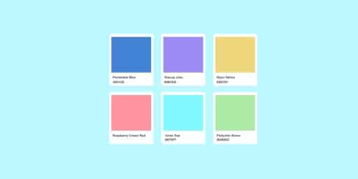
Get Ahead Of The Game: Incorporating the Latest Colour Trends Into Your Brand
Are you tired of your competitors outshining you with their sleek branding and eye-catching designs? One way to stand out from the crowd is by incorporating the latest colour trends into your work.
In 2023, we’re seeing a rise in bold and vibrant hues that demand attention. Neon greens and pinks, electric blues, and fiery reds are all set to make a statement. These colours convey a sense of energy and excitement, and they’re perfect for brands that want to make a splash.
Wassily Kandinsky- Russian painter and art theorist
“Colour is a power which directly influences the soul.”
The key is to find the colours that best represent your brand and its values. Don’t be afraid to experiment with different colour combinations until you find the perfect match. And remember, using the latest colour trends isn’t just about keeping up with the competition – it’s also a way to showcase your creativity and stay ahead of the curve.
Choosing The Right Colour Palette For Your Brand
Choosing the right colour palette for your brand is crucial as colours can affect how people perceive your business. Consider the emotions you want to convey and your target audience, as different colours have different meanings in various cultures.For example, red is often associated with passion and excitement in Western cultures, but can be seen as a symbol of luck and prosperity in some Asian cultures.
Use a colour wheel to choose complementary colours and balance light and dark colours. Take your time to find the right colours that align with your brand’s values and message. With the right colours, you can create a memorable and effective brand that stands out from the competition.
If you want to make a bold statement with your branding, incorporating bright and vibrant colours is a great way to do it. These bold hues can help your brand stand out in a crowded market and convey a sense of energy and excitement.
One way to use bold and vibrant colours is to make them the focal point of your design. Consider using a bright and eye-catching colour for your logo or primary branding element. This can help your brand get noticed and make a memorable impression on your audience.
Another way to use bold colours is to combine them with more neutral or subdued tones. This can create a striking contrast that draws attention to your brand while still keeping it balanced and visually appealing.
With these tips in mind, you can use bold and vibrant colours to make a statement with your branding and differentiate your business from the competition.
Things To Avoid
here are some things to avoid when branding:
- Copying your competitors: It’s important to differentiate your brand from your competitors, and copying their branding can lead to confusion and a lack of authenticity.
- Inconsistency: Consistency is key in branding. Using different logos, colours, or messaging can make your brand look unprofessional and untrustworthy.
- Overcomplicating your message: Your branding should be simple and easy to understand. Avoid using jargon or confusing language that might alienate your audience.
- Neglecting your target audience: It’s important to consider your target audience when developing your branding. If you don’t understand who you’re trying to reach, your branding might not resonate with them.
- Failing to evolve: Your branding should evolve and adapt as your business grows and changes. Neglecting to update your branding can make your business look outdated and uninterested in innovation.
- Going too generic: Generic branding can make your business look unremarkable and unmemorable. Try to find unique and creative ways to stand out from the competition.
Key Takeaways
Colour is a powerful tool in branding that can influence customer perception and behaviour.Choosing a colour palette that aligns with your brand personality, values, and target audience is crucial and also consider the psychological effects of colours on people, as well as the cultural connotations of colours in different regions.
Don’t choose colours solely based on personal preference or current trends, and also avoid using colours that are too similar to those used by competitors, as this can lead to confusion and dilute brand identity.


